

NZ kiwi #1
Original Barplot
The original barchart is from an earlier post. The data is derived from an Oracle table which had been scrubbed, containing the 76,000 most common English words. That earlier R code used the vanilla barplot() method to create the graph from the imported data frame.
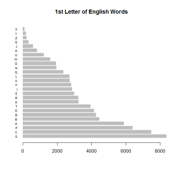
Original R barplot() graph, sorted by wordcount
GGPLOT2 and Layers
We want to enhance this visual (right) with more X-axis information, so that in addition to the raw counts, in thousands, for words beginning with individual English letters, we can also show the percentage of the entire lexicon consumed by a certain beginning letter. We will accomplish this by superimposing vertical (or horizontal if the graph is flipped) value lines over the existing chart at intervals of 2%. We know from the dataset that 2% of the entire lexical wordcount corresponds to about 1520 words. Finally, we’ll also need to supply text to label these new grid lines, and do so in a location which does not muddy up the labels already present for the X-axis. Here’s the R code for the first pass. Note that although the package name is ggplot2, the actual call to invoke it is: ggplot.
w h i t e s p a c e
# grab the data from the Oracle CSV file into R
> first_letters <- read.csv("english_firstletter.csv", header=TRUE, sep=",", as.is=TRUE)
# ggplot2 needs external library packages — only necessary once
> install.packages(c("plyr", "reshape2", "stringr", "ggplot2"))
# load package into R memory for present workload — necessary each session
> library(ggplot2)
# execute first layer of ggplot2 bar plot…
> bp0 <- ggplot(first_letters, aes(x = factor(ALPH), y = WC))
# build additional attributes of bar plot…
> bp0 <- bp0 + geom_bar(stat = "identity", fill="lightgreen", colour="blue")
> bp0 <- bp0 + theme(axis.title.x = element_blank()) + theme(axis.title.y = element_blank())
# display the basic bar chart
> bp0 + coord_flip() + ggtitle("Wordcounts for English 1st Letters")
w h i t e s p a c e
One of the neat things about the R language is how flexible it is regarding datatypes; nearly anything can be assigned to a variable name. We will use this coding freedom to quickly ‘layer’ the current GGPLOT2 graphic with other information describing grid lines and %-labels. We’ve seen this technique already illustrated above; the variable bp0 contains the initial result of the GGPLOT2 call and it is overwritten several times with successively more complex results (layers). The first layer was about color, and the second about axis labelling, and during the final output the axes were flipped. The same R session is continued below, showing the enhancements with the GEOM_HLINE and ANNOTATE clauses.
w h i t e s p a c e
# session cont’d…
# enhance plot with annotation layers for 2% intervals
> bp0 <- bp0 + geom_hline(aes(yintercept=760), colour="orange")
> bp0 <- bp0 + geom_hline(aes(yintercept=1520), colour="brown")
> bp0 <- bp0 + geom_hline(aes(yintercept=2280), colour="orange")
> bp0 <- bp0 + geom_hline(aes(yintercept=3040), colour="brown")
> bp0 <- bp0 + geom_hline(aes(yintercept=3800), colour="orange")
> bp0 <- bp0 + geom_hline(aes(yintercept=4560), colour="brown")
> bp0 <- bp0 + geom_hline(aes(yintercept=5320), colour="orange")
> bp0 <- bp0 + geom_hline(aes(yintercept=6080), colour="brown")
> bp0 <- bp0 + geom_hline(aes(yintercept=6840), colour="orange")
> bp0 <- bp0 + geom_hline(aes(yintercept=7600), colour="brown")
# enhance plot with annotation layers for text labels
> bp0 <- bp0 + annotate("text", y = 1520, x = "Y", label = "2%")
> bp0 <- bp0 + annotate("text", y = 3040, x = "Y", label = "4%")
> bp0 <- bp0 + annotate("text", y = 4560, x = "Y", label = "6%")
> bp0 <- bp0 + annotate("text", y = 6080, x = "Y", label = "8%")
> bp0 <- bp0 + annotate("text", y = 7600, x = "Y", label = "10%")
# display the enhanced annotated bar chart
> bp0
w h i t e s p a c e
Note: There may be more efficient ways to code this… in fact, I hope so! I’m not an R jockey. Revealing some of it’s roots within Fortran-77, loop iterators in R are often chosen from among {i, j, k}. So, if you wanted to be more obscure but briefer, you could handle the horizontal grid code somewhat as follows, where the ‘%%’ operator indicates modulo arithmetic:
w h i t e s p a c e
# enhance plot with horizontal grid lines…
> hl_colors <- c("brown", "orange")
> for (j in 1:10) {
> bp0 <- bp0 + geom_hline( aes(yintercept=j*760), colour=hl_colors[1 + j%%2] )
> }
w h i t e s p a c e
Now, let’s take a look at the final graphical output these R snippets produced, before and after the annotation layers. They can be clicked for greater resolution viewing:
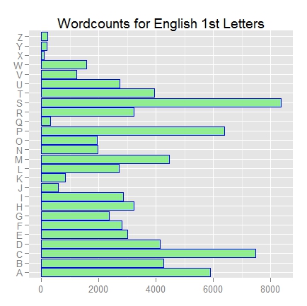
ggplot2 bar chart – before annotation layers

ggplot2 bar chart – after annotation layers
w h i t e s p a c e
I chose not to have R flip the axes for the second graphic, because it made for a cleaner looking plot as far as the percentile label texts were concerned, giving horizontal instead of vertical superimposed grid lines. As can be seen, with a small amount of code one can produce some pretty nice visual representations in R. The layer concept is a powerful and simple way to build complexity, easily. It all comes down to gaining familiarity with some packages. The Learning R blog is another resource containing a wealth of valuable examples, and in particlar takes the approach of showing how various ‘found’ graphics could be rendered via ggplot2. Here’s the blog’s discussion about barplots.
A Second Example
Now let’s turn away from barplots and wordcounts, and look at a new layering example featuring a scatter plot and NFL (American football) data. This dataset, also developed in an earlier article, contains yearly results from the NFL 2012 season, the gist of which can be viewed below. But we are are going to enhance and aggregate the data within Oracle first, and then import the results into R for visualization.
The rows in this table contain individual scores for all 256 games of the regular season, excluding the playoffs. We are going to build some useful aggregate stats off this base table for each team (there are 32 in the NFL): average offense
(points scored), average defense (points scored against), average victory (or defeat) margins, and some ranking info for each of these elements. Finally we will construct a new element called ‘Power Factor’ which combines the defensive and offensive rankings into an overall efficiency rating. Here’s the SQL:
w h i t e s p a c e
WITH base_stats AS
(
SELECT team,
SUM(DECODE(wlt, 'WIN',1.0, 'LOSS',0, 'TIE',0.5, 0)) wins,
AVG(ptsf) AS pts_off,
AVG(ptsa) AS pts_def,
AVG(ptsf) – AVG(ptsa) AS pts_margin
FROM nfl2012_scores
GROUP BY team
),
interim_stats AS
(
SELECT team, wins, pts_off, pts_def, pts_margin,
RANK() OVER (ORDER BY pts_off DESC) AS rank_off,
RANK() OVER (ORDER BY pts_def ASC) AS rank_def,
RANK() OVER (ORDER BY pts_margin DESC) AS rank_margin,
64 – (RANK() OVER (ORDER BY pts_off DESC)
+ RANK() OVER (ORDER BY pts_def ASC)) AS power_factor
FROM base_stats
)
SELECT
team, wins, pts_off, pts_def, pts_margin,
rank_off, rank_def, rank_margin, power_factor,
RANK() OVER (ORDER BY power_factor DESC) AS power_rank
FROM interim_stats
/
w h i t e s p a c e
This SQL query creates a number of interesting data elements from the original data. The results could either be exported wholesale to R or re-created with R functions from the original smaller dataset (which R would need access to). I usually do the former, using SQL Developer‘s CSV output option, since I’m more facile in SQL and don’t want to type complex SQL commands into R over an RODBC link. For the purposes of this blog, the visualization capabilities of R are mainly what’s highlighted. Here’s our new derived dataset:
I want to make a scatter plot which illustrates the offensive, defensive, and overall prowess of all teams along with several other dimensions of meaning.
w h i t e s p a c e
# grab the data from the Oracle CSV file into R
> nfl <- read.csv("nfl2012_stats.csv", header=TRUE, sep=",", as.is=TRUE)
# ggplot2 needs external library packages — if not previously installed
> install.packages(c("plyr", "reshape2", "stringr", "ggplot2"))
# load package into R memory for present workload — necessary each R session
> library(ggplot2)
# expose the dataframe to GGPLOT2…
> sp <- ggplot(nfl, aes(PTS_DEF, PTS_OFF, color=POWER_FACTOR))
# build scatter plot foundation…
> sp <- sp + geom_point(shape=20, size=.6*nfl$WINS) + scale_x_reverse()
+ scale_colour_gradient(low = "red")
# set up axes labels and titles…
> sp <- sp + xlab("Defensive Prowess >>") + ylab("Offensive Prowess >>")
> sp <- sp + ggtitle("NFL 2012 Regular Season")
# add break-even diagonal and print…
> sp <- sp <- sp + geom_abline(intercept = 0, slope = -1, colour = "green", size = .75)
> sp
w h i t e s p a c e
This much produces the basic scatter plot, with plotted points for each team, sized and colored according to various factors, and a green ‘slope’ line demarcating where points scored exactly equals points allowed. Note that I added a fudge factor of 60% to the point size computations because the actual points were too large and they merged together illegibly. To enhance the plot, we’re going to add layers for several items: shaded regions identifying ‘excellent’ defensive and offensive stats, labels for each team, and we will also explicitly remove the automatically generated color gradient legend because it causes the plot to bunch up too much horizontally.
w h i t e s p a c e
# undo default Legend for color gradient…
> sp <- sp + theme(legend.position=”none”)
# add shaded regions for top quintiles…
> sp <- sp + annotate("rect", xmin = 14, xmax = 19.75, ymin = 20, ymax = 33, alpha = .1,
colour = "brown")
> sp <- sp + annotate("rect", xmin = 17, xmax = 29, ymin = 26.6, ymax = 35.6, alpha = .2,
colour = "orange")
> sp <- sp + annotate("text", y = 35, x = 26.8, label = "OFF. TOP 20%", size=3)
> sp <- sp + annotate("text", y = 20.7, x = 16.2, label = "DEF. TOP 20%", size=3)
# add team names for each plotted point…
> sp <- sp + annotate("text", y = 34.5, x = 20.6, label = "NE", size = 2, color = "dark blue")
> sp <- sp + annotate("text", y = 29.8, x = 18.8, label = "DEN", size = 2, color = "dark blue")
> sp <- sp + annotate("text", y = 28.7, x = 27.9, label = "NO", size = 2, color = "dark blue")
. . .
> sp <- sp + annotate("text", y = 24.8, x = 22.1, label = "BAL", size = 2, color = "dark blue")
> sp <- sp + annotate("text", y = 21.8, x = 22.7, label = "CAR", size = 2, color = "dark blue")
> sp <- sp + annotate("text", y = 22.7, x = 23.9, label = "TB", size = 2, color = "dark blue")
# print completed plot…
> sp
w h i t e s p a c e
view entire R code
w h i t e s p a c e
NFL 2012 scatterplot – first take

NFL 2012 scatterplot – completed
w h i t e s p a c e
Legend for Completed Plot:
• Point Location, Horizontal – avg points scored (PTS_OFF) (varies between 13 and 35)
• Point Location, Vertical – avg points yielded (PTS_DEF) (varies between 15 and 30)
• Point Size – number of WINS on the season (varies from 2 to 13)
• Point Hue – POWER_RANK, a compilation of all other seasonal ranking categories (blue better; red worse)
• Green Diagonal Line – demarcates where points scored breaks even with points yielded
• Vertical Distance from Green Diagonal – overall offense/defense prowess (MARGIN)
• Shaded Region, Lighter – Top quintile Offensive teams
• Shaded Region, Darker – Top quintile Defensive teams
w h i t e s p a c e
It’s common, almost necessary, to develop GGPLOT2 graphics iteratively. You can see that the first draft tends to crunch up the X-axis because of the handy automatic legend generated by the R package whenever a color gradient is used to embody a meaningful variable. An explicit command was used in the final pass to remove this default legend in favor of adding more information.
A Little Analysis
In this plot, the better teams are located towards the ‘northeast’ quadrant while the worst teams reside in the ‘southwest’. Compare plotted points for two of the teams, NYG and IND, or the New York Giants and the Indianapolis Colts respectively (easier if you expand the graphic).
NZ Kiwi #2
~RS
P.S. — Disclaimer: I totally dig Kiwis, New Zealand and New Zealanders. 🙂
