
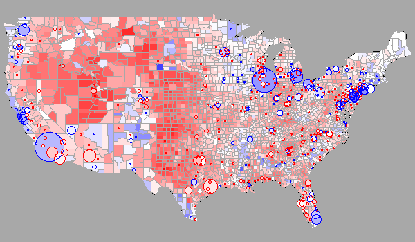
 The data presentation graphic at right, and many of those sprinkled throughout this article (click them for better resolutions), are highlights from an enthusiast’s gallery which have been produced by the R statistical software package. R is an open-source programming language and environment which has gained much popularity among academics who want to apply statistical methods in their research and add visual pizazz to their publications. It is an interpreted language, thus fairly easy to get started with. Also, being open-source, it is free and widely extensible; many packages and libraries are available and the list keeps growing. This recent STRATA conference primer session gives several recommendations on how to get started with R on your laptop:
• Download R v2.15.3 (@ http://cran.r-project.org/)
• Download R Studio IDE (@ http://www.rstudio.com/ide/)
• install.packages(c("plyr", "reshape2", "stringr", "ggplot2"))
w h i t e s p a c e
Interfacing Oracle and R
Oracle is integratable with R in several ways. First, you could acquire an Exadata machine and take advantage of the fact that Oracle R Enterprise (ORE) comes bundled with it as part of the Oracle Advanced Analytics Option. This offering is part of Oracle’s overall BI marketing strategy, pushing their Exalytic BI-on-a-desktop machines. You can view a series of free educational videos about ORE. Let’s assume, in solidarity with frugal enthusiasts worldwide, that you’d like to circumvent this $ix-figure (at least) approach.

 Another choice would be to simply purchase the Oracle Advanced Analytics Option and attach it to your existing database license. But we are going to explore the simplest route, which is to assume you already have or can acquire open-sourced R tools and are looking for a way to feed Oracle database data to it for analytic processing. There’s a proviso in this, in that Oracle marketing literature states that a real limitation exists for R programs which have to deal with large quantities of data natively, and a design element of the ORE package is to widen the pipeline and place the datasize strain onus on the database. Our current purpose, however, is simply to get rolling with R and Oracle.
Consuming Database Tables from R
I checked out the latest release of the ROracle package, whose primary author and maintainer is Denis Mukhin at Oracle. It enables ODBC-style calls to open connections to a database and fetch result sets. There’s a detailed Oracle blog entry by Mark Harnick which tests the relative performance of three Oracle-to-R connectivity tools: ROracle, RODBC, and RJDBC. It compares things like connection times in bulk and SELECT results for various table shapes (row counts and column counts). Worth looking at.
Here are some examples which should look familiar to ODBC users:
dbcon <- dbConnect(drv, username="scott",
password="tiger")
dbrs <- dbSendQuery(dbcon, "select * from emp
where deptno = 10")
db_df1 <- fetch(dbrs)
As of this writing, ROracle binaries are freely downloadable for Linux and Unix platforms, but if you’re running on top of Windows you will need to do some linking and building. The more generalized db-access package RODBC is also available within R and can fetch from Oracle databases.
Scalar (one-dimensional) data structures within R are known as vectors. Matrices (2- or N-dimensional data structures) are known as data frames. In R, vectors are assigned and signified via the c() function. The cbind() function can be used to associate two identically sized vectors, and the data.frame() function sets up a matrix. A useful trick to know is that most R functions are self-documenting. To get help, you simply enter ‘?function-name‘.
# Assign a vector variable
listA <- c(2012,2011,2010)
# Combine two vectors
cbind(listA, listB)
# Assign a data frame variable
df1 <- data.frame(cbind(listA, listB))
A very common way to get external data into R is to use CSV files. These are the same flat file formats which are consumed by Excel. R uses the read.csv() method for this, and the target of the read.csv function is a data frame (which needn’t be previously declared). In R there is the concept of a ‘working directory’ where input and output files can reside; this is where incoming CSVs should be placed. You define this work folder via the File/Change Dir… option within the R menu bar. It’s easy enough to have SQL*Plus output a result set as an external table here as well. I’ll mention two ways to do this. The first is to monkey with SQL so that it outputs CSV-formatted rows, including comma-separated field values and quoted column names. Tom Kyte has a nice generalized PL/SQL procedure which does this; it accepts parameters for a table to output and info concerning the output location. You can override the default base query it uses with your own SQL string. Read about it here or just view the procedure below. The other handy way is to use SQL Developer if you’ve got it. Just click on the right choices; it lets you output CSVs from any query result display.
Plotted Oracle Data
I used the following SQL to create some picture-worthy output and exported it as a CSV and then placed the file into my R working directory. The table involved is a cleaned up list of English words, numbering about 76000. (Read this earlier post concerning password hacking if you want to get a sense of this wordfile’s origin and how it’s been manipulated.) The query counts the number of English words according to which letter they begin with.
w h i t e s p a c e
COUNT(*) AS wc FROM work_wordlist
GROUP BY UPPER(SUBSTR(lexeme,1,1)) ORDER BY 2 DESC;
ALPH WC
==== =====
S 8377
C 7489
P 6394
A 5894
M 4457
B 4267
D 4142
T 3953
H 3241
R 3239
E 2998
I 2866
F 2820
U 2732
L 2712
G 2366
N 1942
O 1940
W 1590
V 1221
K 834
J 600
Q 329
Z 211
Y 186
X 104
26 rows selected.
w h i t e s p a c e
Now, let’s see some examples of R code and the resulting R visuals for this data. In the interactive R session below, an actual window will open up with the resulting graphic whenever an appropriate function is typed. Graphic functions within R normally have many options controlling display style and color and so forth, which you can specify with arguments. Sample R help panels for some of the functions used are linked below to give an idea of the range of visualization options as well as the documentation style used in R. A good way to explore is to try out the examples usually given at the bottom of most function manual pages. I saved the graphics as JPGs and have displayed them below the R session.
• Some R function manual pages: read.csv() plot() barplot() pie()
w h i t e s p a c e
> # Grab the data from CSV file into R…
> first_letters <- read.csv("english_firstletter.csv", header=TRUE, sep=",", as.is=TRUE)
> # Show the top 6 entries…
> first_letters[1:6,]
ALPH WC
1 S 8377
2 C 7489
3 P 6394
4 A 5894
5 M 4457
6 B 4267
> # Show least common letter beginning English words…
> first_letters[26,1]
[1] "X"
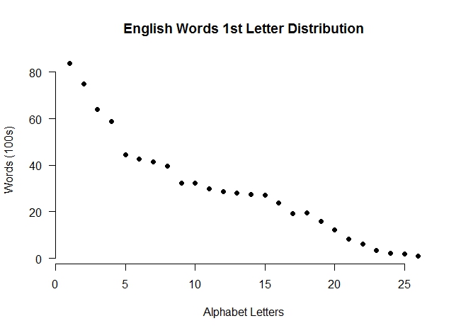
> plot(first_letters[,2]/100, las=1, xlab=”Alphabet Letters”, ylab="Words (100s)",
+ main="English Words 1st Letter Distribution", bty="n", pch=19)
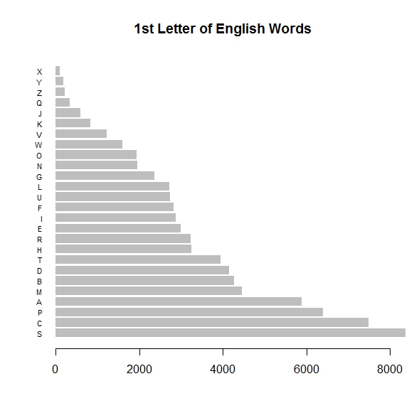
> barplot(first_letters$WC, names.arg=first_letters$ALPH, horiz=TRUE, las=1,
+ cex.names=0.7, border=NA, main="1st Letter of English Words", xlim=(0,8000))
> # omitting [J,Q,Z,Y,X] to pie-chart top 21 first letters…
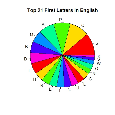
> pie(first_letters$WC[1:21], radius=1, col=rainbow(7),
+ main="Top 21 First Letters in English", labels=first_letters$ALPH)
w h i t e s p a c e
R point plot – click to enlarge
R barplot – click to enlarge
R pie chart – click to enlarge
w h i t e s p a c e
Plot: Ordinary R plots can designate datapoints in several ways, the pch=19 option directs it to use large black dots as shown.
w h i t e s p a c e
Barplot: With this function there are even more customizations possible. In this instance the border enclosing the graph has been removed and the cex.names=0.7 directive controls the height of the y-axis labels. A useful visual aid here would be to overlay vertical lines on the bar chart indicating 2%, 4%, 6% etc. of the entire English wordcount. Since our wordlist contains about 76K words, the 2%-intervals would occur about every 1520 words. So, “S” for example, at over 8000 words, accounts for about 11% of all English words. Overlays are possible in R graphics but they are beyond the scope of this present article.
w h i t e s p a c e
Pie: In the pie chart, I eliminated the five least frequent letters to begin English words because they really bunch up visually. Taken together these five (J,Q,Z,Y,X) account for less than 1400 words, which is a little bit more than the letter “V”, or somewhat less than the letter “W” for comparison sake. In contrast the top six letters (S,C,P,A,M,B) account for the first letter of about 50% of all English words. The optional parameter col=rainbow(7) causes the pie slice colors to rotate among seven ‘rainbow’ hues.
w h i t e s p a c e
R Coding Tutorials
To develop fluency you can explore R independently of Oracle right on your desktop. Nathan Yau provides an intro tutorial aimed at getting basic charts and graphs working. You can either impute some data directly, as he shows, or avail yourself of some the large built-in supply of real world datasets which are included with R. Further tutorials are available at the flowingdata.com website, though you’ll need to sign up as a member to access them. Still another recommended resource is the brief e-book “Data Mashups in R” from O’Reilly Press. It walks you through a multi-faceted data conceptualization problem involving home foreclosures and geospatial mapping, providing an orientation to R along the way.
w h i t e s p a c e
R does Animation!

mandelbrot set animated GIF: click me!
Finally, if you want to mess around with some pure R code, independently of a database, you might enjoy this demo snippet from Wikipedia. It implements 20 generations of a Mandelbrot Set as an animation. Click on the image to activate the .GIF. If you have access to an R environment you can try fiddling with some parameters (red), or even color assignments, and observing the differences. Named after the 20th century French mathematician who specialized in Complexity Theory, Mandelbrot sets became quite popular thirty years ago as a way to visually model fractal curves, seen by some as the underlying construction mechanism for forms and shapes in Nature.
Make certain first that you have installed the library package ‘caTools’; it produces the animation from the computed array of complex numbers. You’ll notice from this snippet how loosely typed R is as a programming language. Spontaneous variables can be assigned arrays, integers, complex numbers, and function results, all without formal declaration.
w h i t e s p a c e
library(caTools) # ext pkg providing write.gif function
jet.colors <- colorRampPalette(c("#00007F", "blue", "#007FFF", "cyan", "#7FFF7F",
"yellow", "#FF7F00", "red", "#7F0000"))
m <- 1200 # define size
C <- complex( real=rep(seq(-1.8,0.6, length.out=m), each=m ),
imag=rep(seq(-1.2,1.2, length.out=m), m ) )
C <- matrix(C,m,m) # reshape as square matrix of complex numbers
Z <- 0 # initialize Z to zero
X <- array(0, c(m,m,20)) # initialize output 3D array
for (k in 1:20) { # loop with 20 iterations
Z <- Z^2+C # core difference equation
X[,,k] <- exp(-abs(Z)) # capture results
write.gif(X, "Mandelbrot.gif", col=jet.colors, delay=100)
}
w h i t e s p a c e
~RS
