
Just a roundup of some recent takes on what people are up to in the area of data visualization. Also, some interesting places to look for more and a few notable blogs where you can keep posted about related topics.
w h i t e s p a c e

m/f life expectancy by country
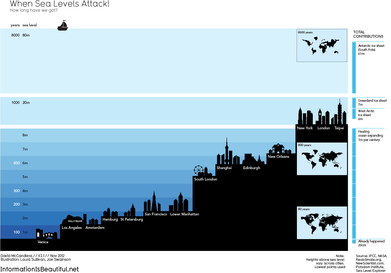
world city rising sea levels
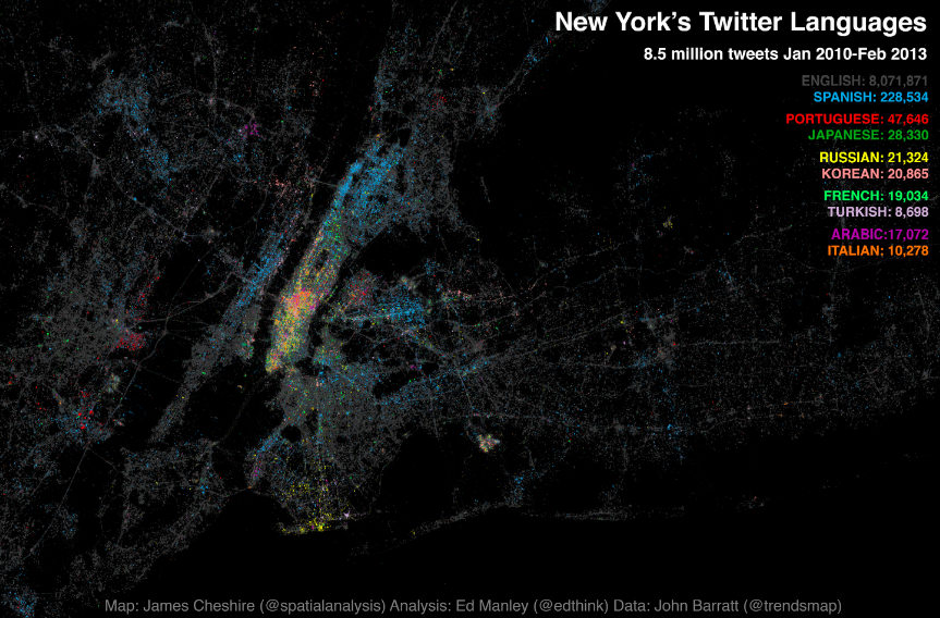
NYC tweet languages
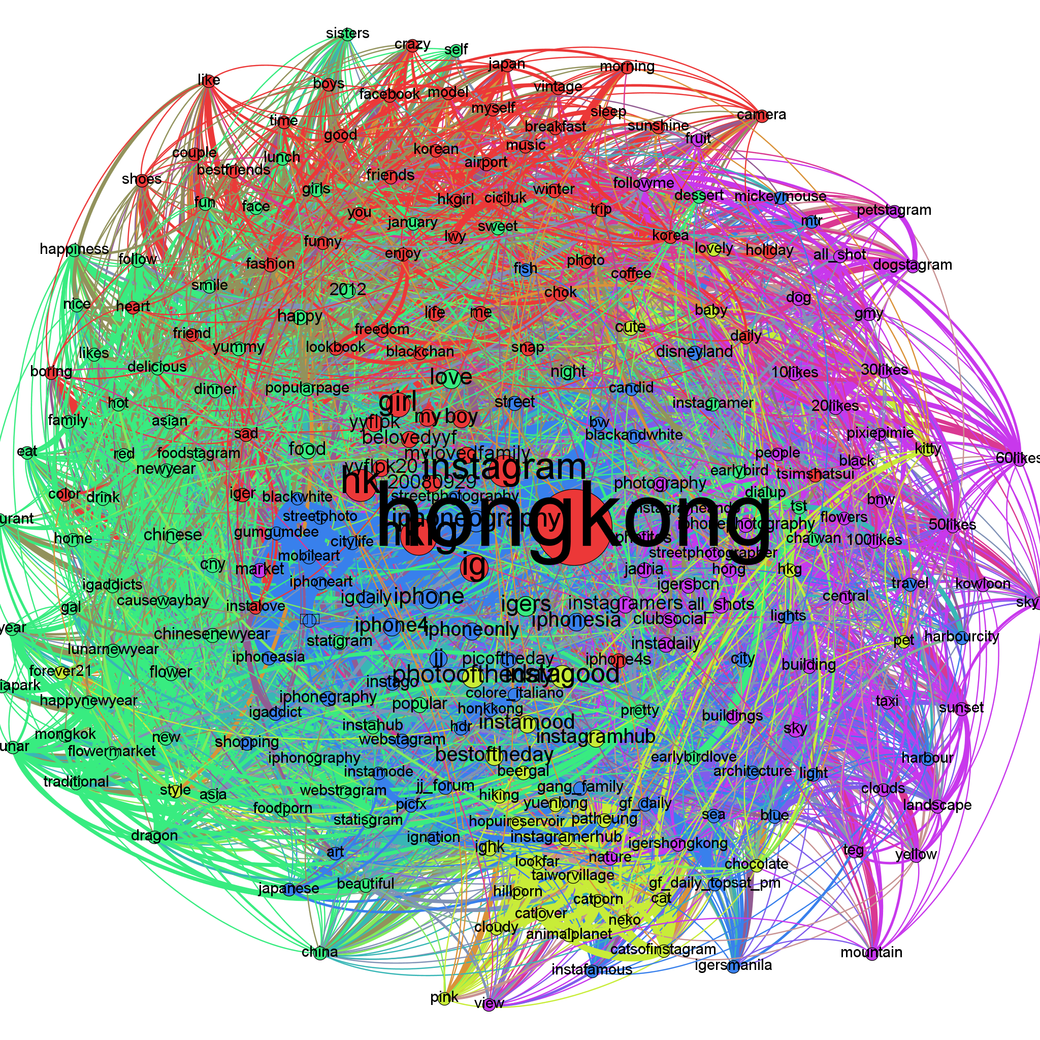
hong kong instagram topics
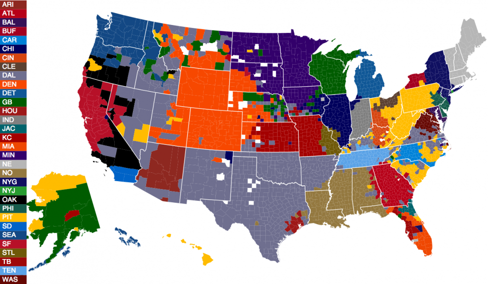
favorite nfl teams by county
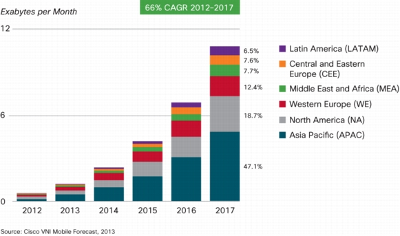
forecasted mobile data traffic by region
Still Images
All of these should be clicked to expand their size for best viewing. I’ve also provided links to the original source locations; some of these links contain explanatory text as well as additional related graphics.
TOP LEFT: A colorful graph of life expectancies in years from birth, contrasting male and female babies, by country and global region. Note that all of the translucent data spheres reside centered above the 45-degree diagonal, showing the longer likely lifetimes for females. This data is from 2010. Source: Wikipedia.
TOP RIGHT: Various global coastal cities are shown with their relative heights in meters above sea level, along with the estimated number of years before immersion assuming predicted rates of ocean rise. Source: Information is Beautiful.net.
MIDDLE LEFT: A colorized map of NYC-area twitter posts. Each color represents a different source language for a tweet. The red cluster in the middle, far left edge, reveals the Portuguese cluster, known as the Ironbound district in Newark, NJ. Once I lived here for awhile, enduring epic World Cup soccer battles between Portugal and Brazil, blaring from every corner shop, the streets and sidewalks spilling over with enthused fans. Source: Spatial Analysis.
MIDDLE RIGHT: Instagram photo sharings from the city of Hong Kong are depicted as organized by their topics. This image expands to reveal deeper information about less common topics. Source: Beautiful Data.net.
LOWER LEFT: Counties across the U.S. are colored according to favorite NFL (National Football League) team. The white-colored counties have no clear favorite team. Source: Visual.Ly.
LOWER RIGHT: Cisco forecasts monthly demands for mobile data bandwidth through 2017. In exabytes (10^18!), depicted by world region. Source: Cisco.Com.
w h i t e s p a c e
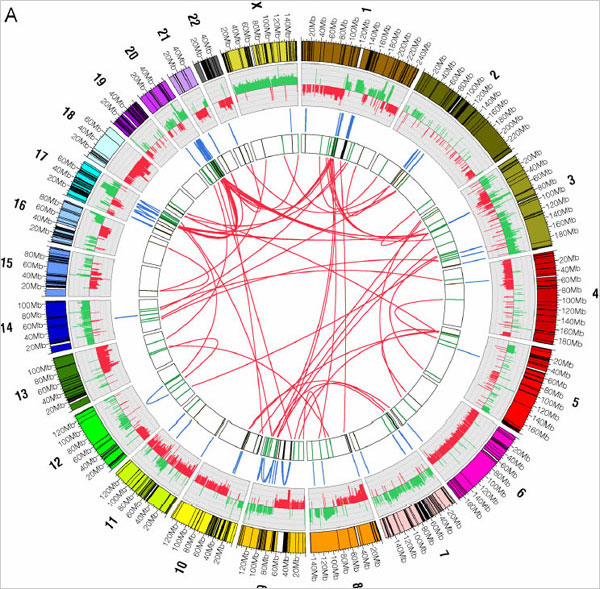
chromosomal base pair copy errors mapping
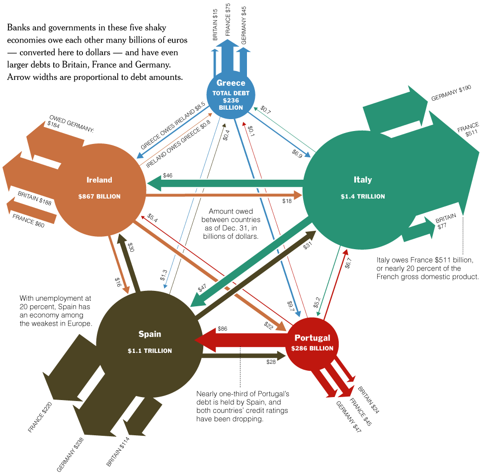
debt interrelations of 5 shaky euro countires
w h i t e s p a c e
ABOVE LEFT: More than 150 base pair segment displacements are mapped for a cancerous cell. Blue lines connect displacements within the same chromosome, while red ones, the majority, connect those between chromosomes. These latter DNA ‘mutations’ are thought to be particularly chaotic, difficult for cellular repair mechanisms to handle. Source: NY Times Science.
ABOVE RIGHT: Spain, Portugal, Greece, Ireland, and Italy are the 5 European economies in most danger of failure. This graphic depicts their various debt inter-relationships, and also their indebtedness to the three main European economies: Germany, France, and Britain. Thickness of the arrows correspond to debt size. Source: NY Times.
w h i t e s p a c e
Interactive and Moving Images
Here are few more which I couldn’t resist, which are either animated or contain interactive elements.
1) First, an example of a heat map, in which color is used to suggest the intensity of one or more variables. This heat map, from the Wall Street Journal tracks inflation rates for dozens of countries over a window of 30 months between 2010 and 2012.
2) The Guardian (UK) is a frequent source of interesting visuals detailing current newsworthy topics. This graphic compares recent U.S. Inaugural addresses. It’s highly interactive and uses various techniques to isolate common and distinct word usage and combinations. Fun to play with.
3) If it’s a short movie you’re after, this animation dramatically shows the accumulated results of U.S. gun murders in terms of lost expected years of life. It starts slowly, illustrating one death at a time, and then builds to a crescendo, using two colors. The bright gold shows the years of life, pre-murder, while the dull grey arcs show the expected years missed out on.
4) A 3-D animation of nearby and not so nearby astronomical objects. Quite interactive. Visual.Ly is a good source for browsing or designing your own data visualizations.
5) These flowing waves depict the eddys and currents of major U.S. film popularity (earnings) over several decades. Amplitude of each colored wave indicates the cultural currency of each film, over time. Mousing over each wave reveals the name of the film; and each can be clicked for further information.
6) Finally a wheel chart comparing campaigning techniques of all 11 major U.S. Presidential candidates during the 2008 election. The connecting arcs indicate mentions (by name) of other candidates during campaign debates. There are six Democrat (blue) and 5 Republican (red) debaters analyzed; name-droppings (or attacks) are arranged chronologically in clockwise order. It’s interesting to contrast the cross-party and intra-party mentionings. These last two graphics are both sourced from the NY Times.
w h i t e s p a c e
Some Notable Blogs
Nathan Yau has a nice blog worth reviewing every so often, known as Flowing Data. He culls a variety of current BD info and innovative visuals from across the web; content is updated frequently. Also, these two blogs mentioned in the post above, though less prolific and interesting, are worth remembering. The Guardian‘s topically salient data blog is here; it has something new almost daily.
~RS

I really like your blog.. very nice colors & theme.Did you make this website yourself
or did you hire spmeone to doo it for you? Plz reply as I’m looking to design my own blog and would like to find oout where u got
this from. many thanks