
credit: tim rasmussen/the denver post. click me!
Week 1
Joys of early season outliers: Peyton Manning is currently on pace for the following all-galaxy QB stat line at season’s end: 112 TDs / 0 INTs / 7392 yards. Last year’s playoff teams went 6-6 during 2013’s opening week. Three teams achieved 2-pt safeties for early 2-0 leads in the first quarter of their seasons: the Jets, Steelers, and Jaguars. The Eagles added another 2-pt safety in the 2nd quarter of their opening game Monday night, upping the total to 4. How unusual is this? During the entire 2012 regular season there were a total of 13 safeties; during 2011 there were just 9. (Source: Sporting Charts)
Correlation Skeptic: Jason Garrett identified forcing turnovers to be a major defensive goal this season for the Cowboys, claiming that a higher turnover count correlates to more wins. Division rival Redskins are also looking to improve on their already decent 2012 turnover stats. Question. How well do turnovers really correspond to winning?
Dallas blogger Joey Ickes has done some interesting and detailed stats mulling for the 2012 seasonal data. Especially intriguing was his material about yards gained per point scored. He has some nice data for the differential between offense and defense concerning this stat, correctly intuiting IMHO that this differential is more correlative to victories than the pure offensive stats would be. But Ickes seems to abandon this differential approach when it comes to turnovers. He predicts that if the defense create at least 30 turnovers on the season then the Cowboys will make the playoffs. (They are already 20% of the way there after week one). But what if the Cowboy’s offense at the same time lose 35 turnovers on the season?
view SQL and R code
w h i t e s p a c e
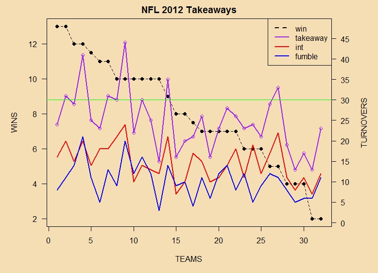
pure takeaways – wins: crummy correlation
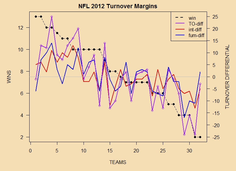
takeaway differentials – wins : reasonable correlation
w h i t e s p a c e
Enlarge these for clear viewing. I was curious about fumbles vs. interceptions also, so they are split out from the pure takeaway values separately. If you find the visual evidence of direct relationship between wins and turnovers a little less than compelling, I’m with you!

takeaways must be compared to giveaways
The green horizontal line in the first graphic indicates the cutoff of 30 takeaways, proposed by Ickes for Dallas. In 2012, you see that eight teams achieved this cutoff or better. Five of these eight teams made the playoffs, for a batting average of .625 — great in baseball but far from reliable in terms of predicting NFL playoff qualifiers. Those who made it in with 30+ takeaways: New England, Cincinnati, Seattle, Atlanta, Washington. Those who missed out: Arizona (33), Chicago (44), and New York Giants (35).
Stats Viz 2013
Team seasonal results are visually uninteresting with low datapoint counts early in the NFL season. So, be patient. They will appear regularly around week 3 or 4.
Notes
1) I use 2.37 as the exponent for computing Pythagorean Wins instead of the vanilla 2.00. The reason has to do with the fact that the usual exponent was originally developed, by Bill James, for major league baseball which has a sample size of 162 regular season games. In the NFL, there are only 16, so the hand of chance plays a more visible role and must be compensated for. This link will justify the math if you’re interested.
2) I count ties as half-wins (and also half-losses). The statistical reason is obvious. A 7-8-1 team, such as last year’s St. Louis Rams, has to be distinguishable from both an 8-8 team and a 7-9 team (for example, last year’s Dallas Cowboys and Carolina Panthers, respectively). Note that the average number of ties during an NFL season, league-wide, is in recent decades less than 1.
3) Pythagorean Wins, for those unfamiliar, is a measure of expected wins based upon comparing a team’s points scored (Offense) and points against (Defense) over the course of a season. Read more about it here.
4) The basic philosophy I am following is that professional football is a team sport, and therein all the drama lies; so for the present at least, I am eschewing individual player stats. Also, there is an effort to see how much can be revealed, in terms of data visualization, with the least raw data. More with less. The three main graphics, comparing team offense and team defense, actual wins and Pythagorean wins, and blowouts versus close game results — all can be driven off a very simple table of weekly results during the season. Perhaps other visualization ideas, employing other datasets, will occur to me later on as time permits, or I can consider requests.
5) Most of this stuff, minus the animated GIFs, has been pioneered in non-football posts at Hearing the Oracle. For example, the end of season NFL 2012 graphics for offense vs. defense and actual vs. Pythagorean look like this:

NFL 2012 team offense vs. team defense

NFL 2012 Actual vs. Pythagorean wins
To further orient yourself, you can look at relevant posts about Oracle SQL, R, and the NFL 2012 season below:
• GGPLOT graphics for the NFL 2012 Season
• Introduction to using R with Oracle databases
• Accessing the Original 2012 Spreadsheet
• SQL queries and results for NFL 2012
w h i t e s p a c e
6) This Week’s Credits: NFL Nerds Foto of the Week is by Tim Rasmussen of The Denver Post, a gorgeous close-up of a broken-up pass featuring sprays of airborne sweat droplets. You can learn more about Tim’s photojournalism work in these interesting interviews. The turnover correlation data was sourced from The Football Database.
~RS
