
Alex Popescu recently unearthed two charts depicting the Database landscape at his interesting blog. They are Venn diagrams, which are reproduced below. The first is sourced from InfoChimps, and the second, which is more complete, is taken from a research slide from The 451 Group. Enjoy.

source: Infochimps
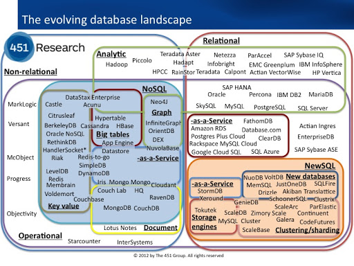
source: The 451 Group
forced whitespace
